

User experience design starts with understanding your customers
Almost 48% of your visitors will judge the credibility of your company/organization based on the design and usability of your website.
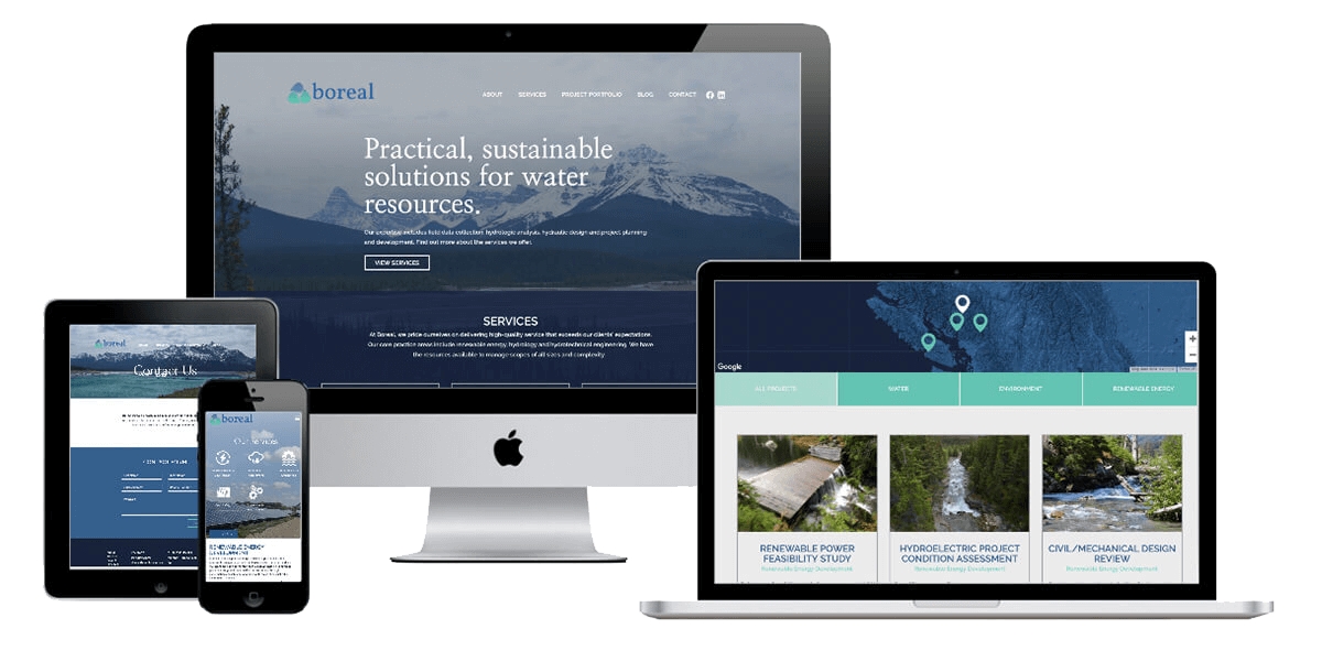
There is no need to design and develop a specific website for each device; Szopa Creative builds websites that adjust seamlessly to the device it's on. Having a responsive design will bring a consistent brand experience across all devices.
FACTS
- Mobile devices are projected to reach 79% of global internet use by the end of 2018.
- Smartphone users check their devices on average about 150 times a day.
- Mobile devices account for nearly 2 of every 3 minutes spent online.
- Nearly 8/10 customers will stop engaging and leave the website when content does not display well on their device.
- There are approximately 1.94 billion active websites in the world.
- A slow mobile site doesn’t just frustrate your customers, it can limit your business. In retail, we see that for every one-second delay in page load time, conversions can fall by up to 20%.

What is responsive web design?
Responsive web design is a web development technique that seeks to create a fully interactive website. It aims to optimize the user’s browsing experience with the aid of sophisticated tools and languages. Basically, the website created will adapt to the size, preference, and taste of the intended audience.
Why you need a web designer for your business in Edmonton?
There are several reasons. In fact, the question should be, “why shouldn’t you?” The return on investment you get is almost unbelievable. Furthermore, it is a cost-effective way of making your business operations more fluid and efficient. Let’s uncover more reasons below.
Responsive Web Design and SEO
Search Engine Optimization (SEO) is one of the buzzwords breaking the internet now. SEO deals with the way your website responds to a particular query on search engines. For example, if you have a retail store in Edmonton and potential buyer types “affordable shoes in Edmonton”, depending on how good your ranking is, your webpage might or might not be the first-page such a buyer sees.
Minimal Maintenance Required
Do you currently have a website for your business? How often do you carry out testing and support? You must be aware of the concomitant troubles and the cost of completing any sort of maintenance. However, with a responsive design, the method employed is inherently standardized, with different sites for mobile and desktop use.
Easier to Track Relevant Metrics and Report Analytics
As a business, you should regularly improve your services. How do you know what to improve? By tracking relevant metrics. Before now, monitoring useful metrics such as user journeys, conversion paths, funnels, etc. used to be very difficult. Now, thanks to improved analytics tools on responsive websites, monitoring and analysis have been made easier.
Customer Retention
Let’s put it to you. If you were browsing two websites, one with a very obscure interface, basically testing your ability to navigate and assimilate the content. The other with friendly UI, easy to use, and flexible both on a desktop and mobile phones, which would you go for?
Your guess is right. According to research, a consistent user experience tremendously benefits your business conversion rates. With a responsive design, you are able to improve the online browsing experience, thereby giving your customers a better first impression.